If you want to know how seriously companies take their CTAs
-
Google conducted A/B tests to check incremental changes like 41 different shades of blue for their displayed links
-
Gmail tested 50 different shades of blue for their CTA till they found a tip converting shade.
-
Firefox improved their conversions by 3.6% by changing the text on their Landing page CTA
They could have easily trusted the vision and expertise of their designers for the simple task. The truth of the matter is, behind design philosophies there is actually hard core data and statistics.
Consult our CTA experts now! What we have learnt over time about CTAs and CONVERSION?
- Your call to action should look like a button and not just an image. It does not necessarily have to be a square or circle.
- CTAs that are buttons perform better than text links. They capture more attention and can be clearly differentiated from the content.
- Use colors that draw attention with ample use of white space. Do not go by the color conventions of using green or red CTAs because they convert more. Use one that stands out.
- Design a CTA which is relevant to the viewer. They should relate to the content and it should align with their needs.
- The copy should give as many specific details about the action that the user is about to take.This removes any kind of confusion.
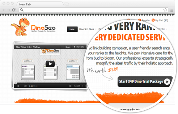
- Use one that clearly states the value that will be delivered after the action. This CTA shows clearly that you get to try a $200 package for just $49.

People get second thoughts when they are introduced to �Buy� or �Sign Up� elements. To tackle this commitment phobia, accentuate such elements with cues that add flexibility to the whole processes through your CTA. For instance, if you are asking audience to subscribe for newsletter, mentioning you can �unsubscribe with single click� will lower the stakes.
- The CTAs should be search optimized when they are in the form of an image, by adding ALT tags which are keywords rich.
- Choose the number of CTAs that you want for your page. A primary and secondary CTA should look different. Browsersize from Google Labs is a great tool find the perfect location for your CTA.
The change in CTA should not just increase your conversion rate but also boost your revenue. This may sound ambiguous. An increased conversion means the number of converted visitors goes up whereas increased revenue means the increased income which might come from the existing conversion rate by increasing the value of your offering. This is only possible through testing.
When a call to action DOESN'T WORK:
lOSS OF rEVENUE
If a landing page lacks an effective call to action, no amount of PPC or ad spend will increase the conversion rate. The visitor either won�t know how to, want to or be able to enter your conversion funnel. Conversions will be few in number. This will eventually affect your overall revenue.
lOSS OF dIRECTION
You won�t be able to direct your customers in the direction that you want. They will feel lost and confused and leave your page, resulting in high bounce rate.
Blue media follows best CTA practices
Getting call to action right requires experience, and familiarity with best practices.
Our team of usability, Information architects and branding experts knows exactly what is required to make the user move ahead in the conversion funnel.
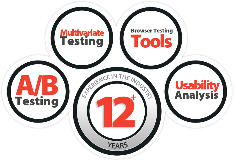
Techniques used at Blue media:
Landing pages bring out the best of search engine and advertising campaigns. With our landing page design services (with special focus on CTA elements), we give businesses better conversions. Get in touch now.

